Chart State
Chart’s structure is very regular, can be (and is) described via relatively simple JSON which is typically called “definition” in this wiki and elsewhere in the documentation.
While we do go into detail here the definition is actually formally described using JSON schema. JSON schema is exactly like XML schema for XML documents - it describes what is but also what isn’t permitted in the JSON document being validated. More importantly, schema also provides default values for a lot of properties which simplifies loading tremendously (especially when there are mandatory properties which can have a default value). This schema system is very simple (sometimes even too much) to author and use. While it’s not required at all, if you’d like to know more about this please see the documentation
Deployment note When deploying to a given site, you will almost always customize the chart definition to reflect the site defaults and look&feel. However, you will not customize the schema. Any time the schema is updated, the chart code is updated too and the two have to be deployed in sync. Differently put you should never customize the schema; if the definition you have does not conform to the schema, modify it so that it does.
Better yet, if you have a capable editor like Visual Studio Code you’ll enjoy autocomplete and validation while you’re editing your definition file. Don’t be fooled by the Visual Studio part, Code is a capable, modern and small-ish Open Source editor based on other Open Source efforts like Electron Shell which powers Atom editor as well and which is itself based on the Chromium. Due to all this Code is cross platform and works great on both Windows and Mac OSX (tested on the latest version of both OSes); it also runs great on Linux.
For an example of a definition, please take a look at a default template/definition (this is used when you don’t explicitly load a document and don’t configure a default template).
This might be a good time to formally define a distinction between a template and a definition: basically, a template is just a definition but without a main symbol/expression specified (meaning we use a special constant PLACEHOLDER to indicate that the symbol/expression will be provided later). This is useful because we can load and manipulate a template just like a definition without triggering any kind of data fetch. Only when we set a main symbol/expression does data fetching enter the stage.
It might also be useful in some scenarios to quickly get a feel of the overall structure of a definition/template, without going into much detail. This can be achieved by calling getChartOutline method which returns the following object:
{ isTemplate, // self-explanatory isDefinition, // ditto main: { isSymbol, // boolean, main plot is a symbol... isExpression, // ... or an expression symbols, // array; symbols of the expression or a symbol of a symbol plot (empty for templates) title // string, symbol name or expression text or `null` for templates }, compare, // array of comparison symbols annotations, // array of annotations studies // array of studies};Now onto the details of a given definition…
In general, chart is described in three parts:
- data which describes core data features like aggregation (and other non-visual aspects)
- display which is used for global pure presentation aspects like colors of UI elements, presence (or absence) of optional decorations like gridlines, format of values on axis, font to be used etc. This aspect is sufficiently self-descriptive that, apart from comments in the schema, we won’t go into details about it here
- panes which represents the body of the chart; this aspect warrants further discussion
Let’s illustrate with a screenshot (a picture is worth more than a thousand words :wink:)
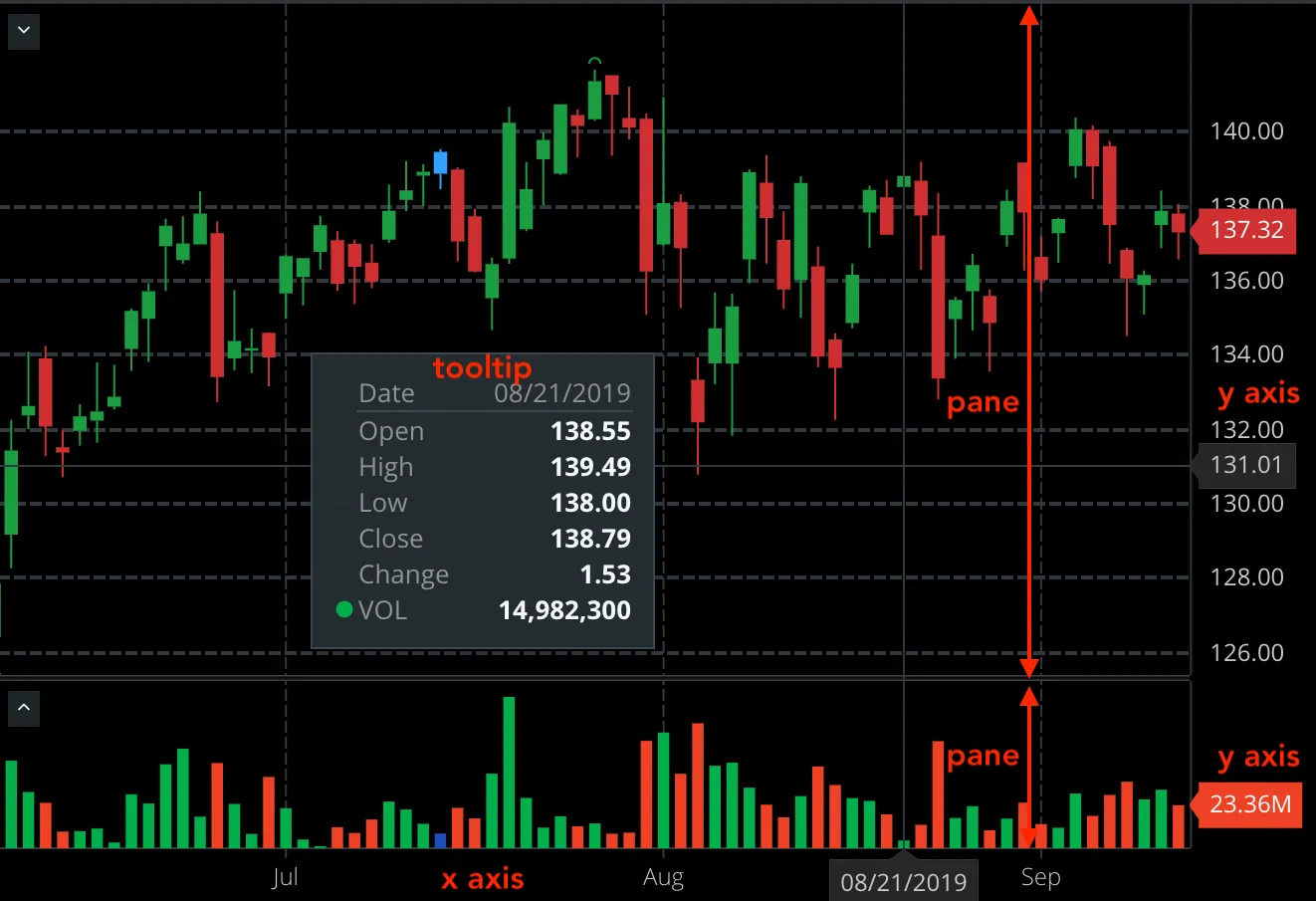
Please open a sample chart definition and simply follow along the text below, JSON keys are named appropriately (a pane is “pane”, plot is “plot” :smile:)…
Panes are rectangular slices which split chart vertically into stripes, each plot has "height" which is a relative height to the other plots (so if we had 3 plots with heights 4, 2 and 1 the first one would occupy 4/(4+2+1) = 57% of vertical space, second would occupy 28% and the third 14%, roughly). Each pane can contain multiple Y (price) axes. What we have on the screenshot is typical, single Y (price) axis per pane. It’s rare but not unusual to have more than 1 Y axis though, especially if you want to overlay drawings which have wildly different scales (for example MSFT and GOOG prices are so different that using ones or the others scale for Y axis would render the other visibly flat).
Each axis will then contain one or more plots. By “contain” we mean that the plots belonging to the same axis share that axis. Axes have comparison field which controls the way we display plots when several are put into the same axis and scale which controls the way we scale the prices across the Y axis. Both are described in detail in the main API section.
The X (datetime) axis is shared between the plots. Apart from being hidden, it can’t be customized much at the moment.
Plots are main logical units of the chart, at the moment the two plots supported are a Symbol plot which draws values for a given symbol (ESH16, GOOG, AAPL etc.) and a Study plot which draws values for a given study/indicator (MACD, Bollinger Bands, Williams’ %R etc). In the near future, we’ll add other types of plots like expressions/formulas (for example (GOOG + AAPL) / 2). Plots are data projections - the data fetched or computed is stored associated with a plot (ignoring caching), where plot describes how that data is drawn.
Plots themselves consist - visually - of curves, which are often lines but also other ways to display data which aren’t lines like candlesticks (on the screenshot) or OHLC “bars”. Each curve represents a “projection” of a subset of fields of the plot (remember, plot contains/references timeseries data for a set of fields like Open, High, Volume or study fields like PercR, RSI, EMA etc) drawn in a particular way. Curves are a main point of customization and contain the following properties:
- colors: a list of colors for the curve; most curves support only one color (lines for example) while some other require at least two (those that vary color per bar, see below); color syntax is same as in CSS
- fields: the fields that the drawing will show; often just one field but for
CandlestickandOHLCstyles (see below) you will needOpen,High,Low,Close,Change(the last one is optional) - style: visual style of the curve, one of:
OHLC,Line,Candlestick,Area,Column,Ribbon(and soonDots,HLC,HL,Step) - lineWidth: for styles where applicable the width of the line (sometimes outline or border of the style)
- varyColorPerBar: boolean which does what it says - the drawing will potentially use a different color from bar to bar (often to indicate movement up/down); when it’s set to
truethe colors array must have at lest two colors; the setting only applicable to some styles - not all - please see discussion below - attributes: array of additional properties for curves, with the following values:
- ChangeBased: when varyColorPerBar the movement up/down is based on the
Changefield (orClosevsPreviousClose(Closeof the previous bar) - OpenVsClose: when varyColorPerBar the movement up/down is based on the
OpenvsClose; this is the default if you don’t provide attributes (only for applicable styles of course, see below)
- ChangeBased: when varyColorPerBar the movement up/down is based on the
- only for studies inputs: list of input parameters for studies, simple name/value objects, like this
{ "name": "Period", "value": 20 } - shift: number of bars this curve should be shifted on the time axis; positive to move forward in time, negative to move backwards; there is no value by default (interpreted as no shift)
Colors per curve style
Over time we’ve evolved the ways one can set colors for a given curve style and since the colors are just an array, it might be tricky to figure out what to provide to achieve desired result.
As said above, if you set varyColorPerBar to false, then in most cases regardless of the number of colors provided only one color will be used (there are only few exceptions listed below). Furthermore, only some styles allow for multiple colors, enumerated below:
Candlestick,HeikinAshi,OHLCandColumnbehave more or less the same: you can set either 2 or 3 colors; first two are always [DOWN, UP] (DOWN meaning the movement of the price is down, UP means no movement of movement up), if set the third color is used for SAME (no movement of price) which also means that UP now means strictly movement upCandlestickandHeikinAshisupport setting 5 colors; the 4th color is used for the candle (body) outline and the 5th color for candle wicks; if the wick color isn’t supplied, we use the outline color; if neither outline nor wick color are supplied, we use the color of the candleHollowCandlesdue to the very specific way (by design) it gets drawn, only supports 2 colors which are interpreted as [DOWN, UP] where direction is interpreted just like forCandlestickwith only 2 colorsAreanormally uses only one color which is used as a fill color; the outline/stroke color gets derived from it (slightly darker shade is generated); if you provide two colors, the second color will be used as an outline colorRibbonis just likeAreaexcept by default no color is used for the outline, only if you provide a second color
That’s all there is to it, it should be intuitive and easy to author even by hand. We should soon have detailed comments in the schema which will help further describe the structure.