Studies
The chart supports a number of well-known studies (indicators) like RSI, MACD, Stochastic, Bollinger Bands and many others. The studies are fully implemented and run on the client side (in the browser). Studies are just plots where the data isn’t coming from a server but is instead calculated. This is very similar to Expressions but instead of a simple mathematical formula - editable by the end user of the product - the study computation/algorithm is much more involved and is usually prescriptive (studies are often named by the people who invented them).
Preview: the licensees of the SDK can now extend the chart with their own studies. Please find more details in the Extending the chart section.
The other aspects of the studies like curves to draw, colors with which to draw them, parameters (most studies are parametrized by things like period of calculation and such) etc. are all customizable in the same way any other plot can be customized, but the studies do have some additional features which we’ll describe in this article.
The studies taxonomy is a JSON file which conforms the studies.schema.json schema, portions of which reference the main schema chart.schema.json as described in the main chart definition file.
All schema files are available in the schemas folder in the SDK (a modern IDE like Visual Studio Code may automatically validate the JSON files against the schema and provide intellisense and other features).
It’s basically a list of study descriptions, each looking similar to the following example:
{ "id": "<study_id>", "meta": { "title": "<study_title>", "overlay": false, "enumerations": [ { "input": "<param3_name>", "values": ["<value1>", "<value2>", "<value3>"] } ] }, "defaults": { "source": "<source_field>", "inputs": [ { "name": "<param1_name>", "value": 100 }, { "name": "<param2_name>", "value": 7.25 }, { "name": "<param3_name>", "value": "<value2>" } ], "curves": [ { "style": "Area", "colors": ["#fc0d1b", "rgba(0,0,0,0)", "#00b04b", "#2624fa"], "fields": ["<study_field>"], "zones": [ { "value": 0.2, "colors": 1 }, { "value": 0.8, "colors": 2 }, { "colors": 1 } ] } ], "levels": [ { "value": 0.2, "line": { "color": "#444", "dashStyle": "LongDash" } }, { "value": 0.8, "line": { "color": "#444", "dashStyle": "LongDash" } } ], "bands": [ { "fill": { "color": "rgba(147,59,248,0.2)" }, "range": { "from": 0.2, "to": 0.8 } } ] }}id is the study identifier which is unique for the list of the studies. meta contains additional info like the title (usually shown in the UI) and whether by default the study should be overlaid or placed standalone in its own pane. You may also find enumerations in the meta field: these will tell you - for a given input - which is the list of allowed values (so that you can show this in the UI appropriately, typically in a dropdown list or a similar element). The default value can be found in the defaults section (described next).
defaults section
defaults contain all the other values as configured by Barchart so that a single “click” action is enough to add the study to the chart (we don’t have to present a dialog to the user asking to fill in all these values). All of the values here are usually (but not necessarily) overridden by the user (especially colors).
inputs contains the main parameters for the computation of study, often a period the calculation is based on, a magnitude of something, a multiplier and so on.
curves is the same one used in the chart definition, already explained in the chart definition except for the zones field which we’ll focus on here.
We’ll also take a deeper look into levels and bands which are at the moment study-specific (though they don’t have to be).
zones
Under the normal circumstances, we’d use the same color for all of the values of a single curve, regardless of their values and position in time - differently put, regardless of their x and y coordinates. In some cases though we might want to color values differently either on the x axis or y axis. Please note that zones as they are configured today apply only to y axis (price axis). We might extend this to x axis (time axis) in the future though.
In practice, the only useful example of zones is the one shown in the example code above and in the screenshot below:
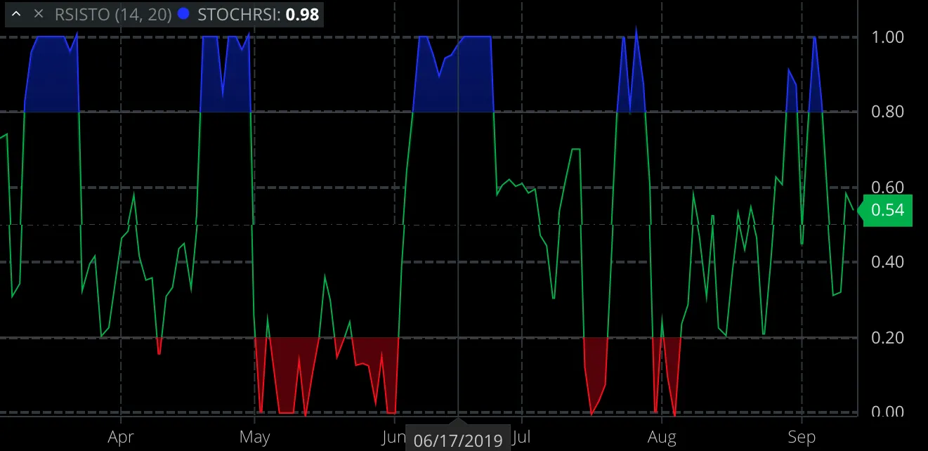
For a given range of values (two, 0.2 and 0.8 here) we plot all values below the lower value one color (red-ish here), everything in between the two values is drawn in a second color (green-ish here) and over the higher value we use the third color (blue-ish here). Basically, first zone’s “from” value is negative infinity, second zone’s “from” is first zone’s “to” and the last zone’s “to” is positive infinity.
Since in this example we’re plotting using Area style, we could specify one or two colors for each area - the fill color of the area and optionally border line color. zone.colors is the number of colors we “take” from colors array for each zone. Typically this would be 1 for most cases.
In this example, first and third zone use single color (both fill and border line are same color) while the middle section uses two - fill is transparent and border line color is green-ish. In total this is 1+2+1 = 5 colors. Important: the last zone does not have a value so it applies to all values above the highest preceding value.
Note that you could use other styles (Line instead of Area) and more zones; while the concept works and the code would work, you’d get something very, very rarely used in the financial industry. Also, things get rather tricky if you use Area and more than 3 zones for reasons outside of scope of this article. That’s why for now it’s recommended to limit ourselves to Area drawing style and 3 zones.
levels
Levels are much more straightforward: just a list of horizontal lines placed at value levels; line is the style of the line and conforms to the same schema like styles of annotations: color is color, dashStyle is the line style (dashed, solid, dash-dot etc.) and width is the pixel width.
You can have as many levels as you like, though it’s customary to have two (one “overbought” and one “oversold” line) or three (additional mid-level line is added). In the example above, we’ve added two long dashed lines of rather dark color at the 0.2 and 0.8.
bands
Bands are just a rectangular areas between two values filled with a given color, often semi-transparent. In the example above, we’ve colored the area between 0.2 and 0.8 with a purple-ish color, fairly transparent. You can have multiple bands in a single study, though it’s customary to have one, between the overbought and oversold values. Bands can be used standalone or combined with levels and/or zones. The example above is deliberately contrived to use all three concepts but in practice we’ll most often use levels, a bit less often bands and finally relatively rarely zones (not always combined with levels).